
Case study of Libresse
Brands use various gender-stereotypical visual tools such as colors, typography, shapes and symbols to reach out to women or men with their products. These tools are based on old conventions about what is considered feminine and masculine. However, our society is constantly changing, where gender and identity are being challenged from various quarters.

Introduction and background for the project
The products in this project are from my bachelor thesis where I explored how brands market their products to different genders based on gender stereotypical assumptions of what the different genders prefer. Furthermore, I looked at the problems associated with a strongly gendered market, where pink is for girls and blue for boys.
Libresse's Ultra pads packaging has visually evolved very little over the years, therefore a redesign of their packaging was perfect to illustrate how one can create a more inclusive design towards everyone who has their periods, without hidden signals about which gender the consumer of the product has.

My research question was the following:
How can one design an alternative to the current design of sanitary products from Libresse that is perceived as more inclusive and counteracts gender stereotypes in society?
Based on this formulation, the redesigned product was produced using the double diamond design methodology.
Highlighted issues with the current design
Today's Libresse packaging differs little from its competitors. The reason being that they use many of the same visual tools, such as handwritten typography, vibrant colors and plastic packaging for their products. Other weaknesses with the current packaging are that the design appears disorganized and challenging to read, the pink color on 4 out of 5 products also contributes to the fact that it is challenging for the consumer to see the difference between the variants. The pink color and the typography used reinforce the impression that the product is only for women, and may seem exclusionary towards gender nonconforming individuals who also need these products.


Keywords for the design: clean, modern, dynamic, concrete and neutral
Key tasks
Objective: Produce a product that appears inclusive and counteracts gender stereotypes in packaging
- Research the market to find out how Libresse can stand out from their competitors (USP)
- Establish a target audience
- Identify weaknesses with the current design (qualitative interviews with individuals from the target audience, as well as a visual analysis of the current design)
- Design research with concept development
- Finalize and test the product with participants from the target audience

Solution to the problem
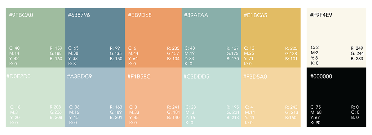
To solve the research question, I first had to investigate what gender stereotypes are and how these affect our society. This was done through relevant theory which pointed out that these gender stereotypes have a number of negative effects linked to society's perception of gender. Furthermore, I explored how brands use different visual means to market themselves to the different genders. On the basis of this, I moved away from a number of stereotypically feminine visual tools such as the color pink and handwritten typography in the redesign, and instead used sans serif fonts and neutral colors for the new packaging. Sanitary products, such as pads, are essentially hygiene products that should not be limited to a specific gender. Especially considering that gender and identity can change throughout a person's lifetime. The new design reflects precisely this, that pads are a hygiene product regardless of what the consumer identifies as.


